Published: Nov 10, 2025
•
7 min read

Note this project is currently incomplete due to its scope.
Design Report
This purpose of this report is to explain the reasoning behind my creative and analytical decisions.
Audience & Intent
This visualization is for a general audience to understand how road design choices affect pedestrian safety, perceived speed, and livability, with the intent to motivate adoption of Dutch-style traffic methods in US road infrastructure.
The goals were to make it engaging, create clear separation between story elements, and keep it intuitive.
Story & Structure
Section Flow:
- The title page shows the visual contrast between US and Dutch infrastructure right away.
- The intro section sets up the context.
- The road network comparison section has three different chart views (speed distribution, road composition, speed by type) you can toggle between.
- The residential roads section has an interactive slider where you can drag through different speeds and see how injury/death risk changes.
- The residential road types section digs deeper into local road design.
I went with this order to start with the big picture data first (here's how different these networks actually are), then zoom into the human impact (here's what speed does to people). It builds from abstract comparison to concrete consequences.
Design Choices
Colors
Colors were chosen from three sources. For the title screen, the main green was picked from the green used on navigation signs on interstates. Navigation and interactive elements used a color palette chosen from ColorHunt.
NC Blue: I used a dark Carolina blue (#002868) as North Carolina's primary color for NC data visualizations to create clear visual distinction from Netherlands data. Tar Heel blue (#4B9CD3) is used as a secondary color for supporting elements.
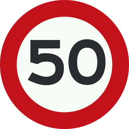
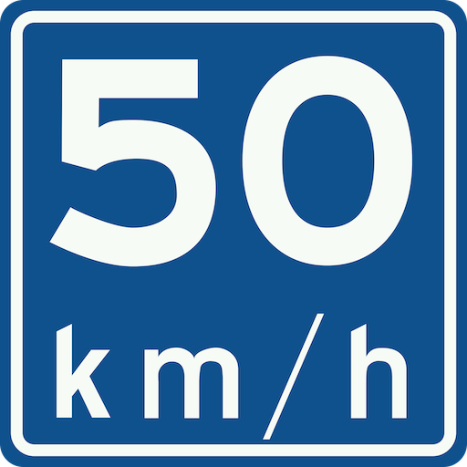
For colors related to the Netherlands, I picked colors from common road signs.
Fonts
For the title screen, I used Overpass, which is an open-source alternative to Highway Gothic (the font used on US road signs). The body font is Lora for readability. Graphs and metrics use JetBrains Mono for that monospace data feel. Fonts are my weakness when working on a design project, I can spend hours looking for a font that aligns with what I want.
Layout
Title Page: I designed it to look like US road signs, with infrastructure differences visible in the background. I added a fade so it doesn't hit you with too much at once.
Section Navigation: Each section "snaps" when you scroll—basically forces you to focus on one thing at a time instead of getting lost in a long scroll. This helps with the Gestalt grouping principle where related info should be visually together.
Visual Hierarchy: I added a scroll indicator on the title page to signal there's more content below. Small black dividers between sections make it obvious when you're moving to a new topic.
Spacing & Clutter: I used lots of padding and white space. Interactive elements get their own space so they're not competing for attention with text or other visuals.
Background: I added a subtle curved background that flows through all the sections. It creates a gentle visual connection between sections, meant to give the impression of a winding road, without being distracting. There is just enough curvature create to keep things from feeling static.
Charts
Treemap for Road Composition: I chose a treemap to show road type composition because it makes proportional differences immediately obvious through area. When you see that Municipal roads take up 84% of the Netherlands' network as one massive rectangle, the dominance is undeniable in a way that a bar chart can't match. The challenge was handling text in small cells. Some road types only represent 1-4% of the network, creating tiny rectangles. Hover tooltips show full details for all cells, ensuring no information is lost. The treemap also uses rounded corners and color gradients within each country's palette.
Accessibility
I ran the site through accessibilitychecker.org and got a 77% score with 15 critical issues. I fixed the two main ones:
- Ensures each HTML document contains a non-empty
<title>element - Ensures the order of headings is semantically correct
Fixing these issues brought my score up to 89%.
Animations
Scroll Transitions: The snap behavior is handled by CSS scroll-snap-type, so I don't have fine control over the transition speed without getting into complex JavaScript territory (outside scope). A major issue is the speed being significantly different between Firefox and Safari.
Graph Animations: D3.js handles the chart animations—bars grow from zero height over 800ms, which feels responsive without being too fast. I used D3's .transition() and .duration() to control timing.
Interactive Elements
The main interactive elements are a speed slider and chart toggle buttons. Both let the audience physically interact with the data instead of just reading about it. It makes the insights feel more personal when you're the one moving the slider and seeing the injury risk jump.
Reflection
What Worked Well: Breaking everything into separate Svelte components made the narrative way easier to manage. If I realized something should come earlier in the story, I just moved the component up. The scroll-snap navigation creates really clear boundaries, and the color coding (Dutch red vs. Carolina blue) makes it obvious which country you're looking at.
<TitleSection />
<IntroSection />
<ResidentialSection />
<ResidentialRoadTypesSection />
<GraphSection />
<SourcesSection />
Challenges: Data alignment was challenging due to the Netherlands and the USA using different standards and different measurement systems. Getting things close to my original vision required a lot of work, and still isn't what I want (the road visualization using the data).
Future Refinements: With more time I'd add sections on traffic calming and intersection design. The scope ended up way bigger than I thought, so most planned sections are not included. I'd also like to learn more about how this road data actually gets collected—the datasets were smaller than expected (~500-800 MB total), but processing them without AI would've taken weeks of manual work. In my free time I may continue working on integrating the road visualization (which is functional) with the data.
AI Usage
I know Svelte pretty well, but I used AI heavily to get the structure up fast—probably half the code is AI-generated. It was especially useful for:
- Initial component setup
- D3.js boilerplate
- CSS grid/flexbox layouts
- Data Analysis (condensing gigabytes of data)